The Importance of Responsive Web Design for User Experience
In today's digital landscape, responsive web design is crucial for enhancing user experience across various devices. With an increasing number of users accessing websites via smartphones and tablets, it's essential that your site adapts seamlessly to different screen sizes. According to a report by Statista, more than half of all web traffic now comes from mobile devices. This shift emphasizes the need for websites to provide optimal viewing experiences, ensuring that users can navigate content easily without the need for constant zooming or scrolling.
Not only does responsive web design improve accessibility, but it also positively influences search engine optimization (SEO). Google officially recommends responsive design as it allows easier indexing and serves all devices with a single URL. Websites that implement this design strategy can benefit from higher rankings in search results. As highlighted in an article by Moz, responsive websites enhance page load speeds, which is another critical factor for user retention and satisfaction. In summary, investing in responsive web design is integral to providing a superior user experience and enhancing your site's visibility online.
How Responsive Design Enhances Conversion Rates
Responsive design plays a pivotal role in enhancing conversion rates by ensuring that websites provide a seamless user experience across a variety of devices. With an increasing number of users accessing the internet via smartphones and tablets, responsive web design helps businesses reach consumers on their preferred screens. A site that's well-optimized for mobile not only improves usability but also results in lower bounce rates, thereby increasing the likelihood of conversions. According to a study by Google, 61% of users are unlikely to return to a mobile site they had trouble accessing, highlighting the direct correlation between responsive design and user retention.
Moreover, responsive design enhances site speed and accessibility, both crucial factors for conversion optimization. Search engines like Google prioritize fast-loading websites, as they provide better user experiences; hence, responsive sites tend to rank higher in search results. Optimized sites not only attract more organic traffic but also engage visitors longer, which can lead to increased sales and lead generation. In fact, businesses that have implemented responsive design report an average increase in conversions of up to 40%, proving that a mobile-friendly approach is essential for today's digital landscape.
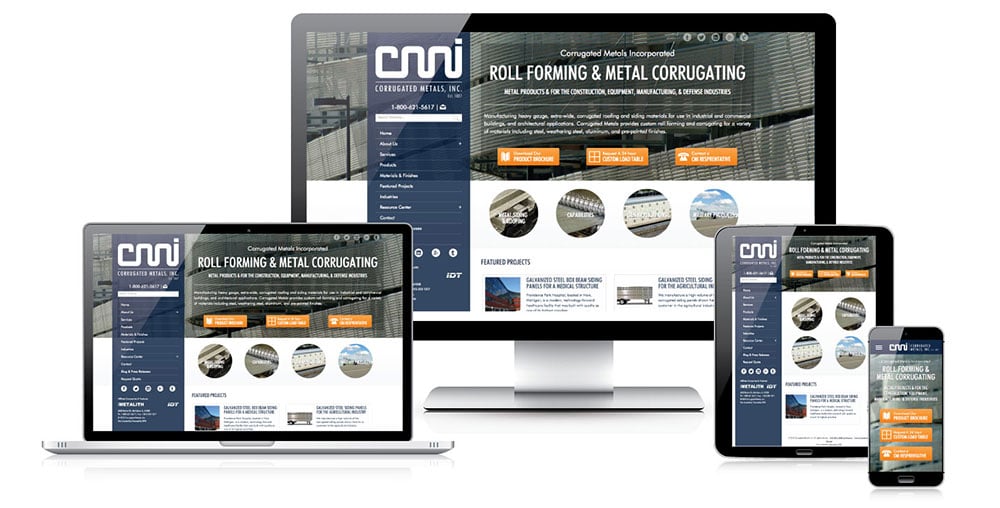
What Is Responsive Web Design and Why Do You Need It?
Responsive web design is an approach to web development that ensures a website's content adapts seamlessly to various screen sizes and devices, providing an optimal viewing experience for users. With more than 60% of global internet traffic coming from mobile devices, having a website that automatically adjusts its layout and functionality is crucial. This design technique employs fluid grids, flexible images, and CSS media queries, allowing the site to maintain usability and aesthetic appeal across smartphones, tablets, and desktops.
Implementing a responsive web design is essential for several reasons. First, it improves user experience by eliminating the need for excessive scrolling or zooming on mobile devices. Furthermore, search engines like Google prioritize mobile-friendly websites in their ranking algorithms, meaning a responsive site can enhance your SEO efforts. Additionally, maintaining a single website with a unified design for all devices simplifies site management, ultimately saving time and resources in the long run.